This project demonstrates multiple iterations and A/B tests to arrive at the final design.
At first, this project was a proof of concept for PayPal Credit application flow to be part of the PayPal app (iOS/Android) but it quickly proved itself to be very effective. Using the research data of past tests, I designed a landing page that educates the user on our product value prop while also satisfying the terms requirements. I also brought the application flow to our PayPal UI standards. I ran a study via Mechanical Turk (MTurk) to help inform the best symbol/illustration for the abstract concepts I wanted to visualize. I created the solution for both U.S. and U.K. regions.
My role: Lead designer
Platforms: Responsive web
Disciplines: UX/UI, Prototyping, User Research/Testing
Tools: Sketch, InvisionApp
Launch: January 2019
The initial proof of concept iteration of the entry point into the application flow doesn’t tell the user any value props regarding the product. The first page of the application also doesn’t explain how it works or its benefits, so about 58% of users drop-off at the first page.
- Educate the user on PayPal Credit value props and benefits so that they can confidently apply
- Increase product comprehension and how it works within the PayPal ecosystem
- Increase click-through rate to acquire more Net New Actives (NNAs)
Over the course of 2 years, we did multiple A/B tests to try solving and improving the comprehension of our product through the landing page. I can’t share those specific findings, but I can talk about the different things I have tried:
- Exploration of carousels, tabs, expandable accordions, large hero messages to organize info
- Various IX patterns to reveal and show legal requirements
- Lo-fi illustrations through MTurk to get directional idea of what makes sense to users
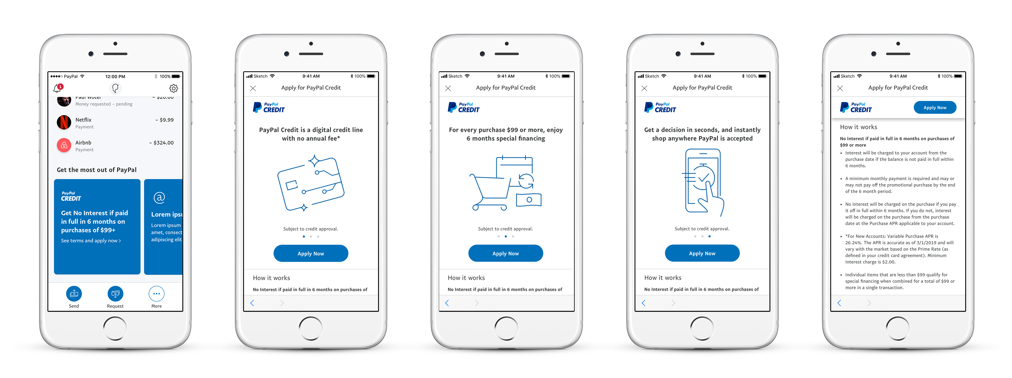
More prominent entry point with strongest value prop content on summary home screen
Carousel of main value props
More info and legal content below
When scrolling down the CTA docks on the header so user can always access it
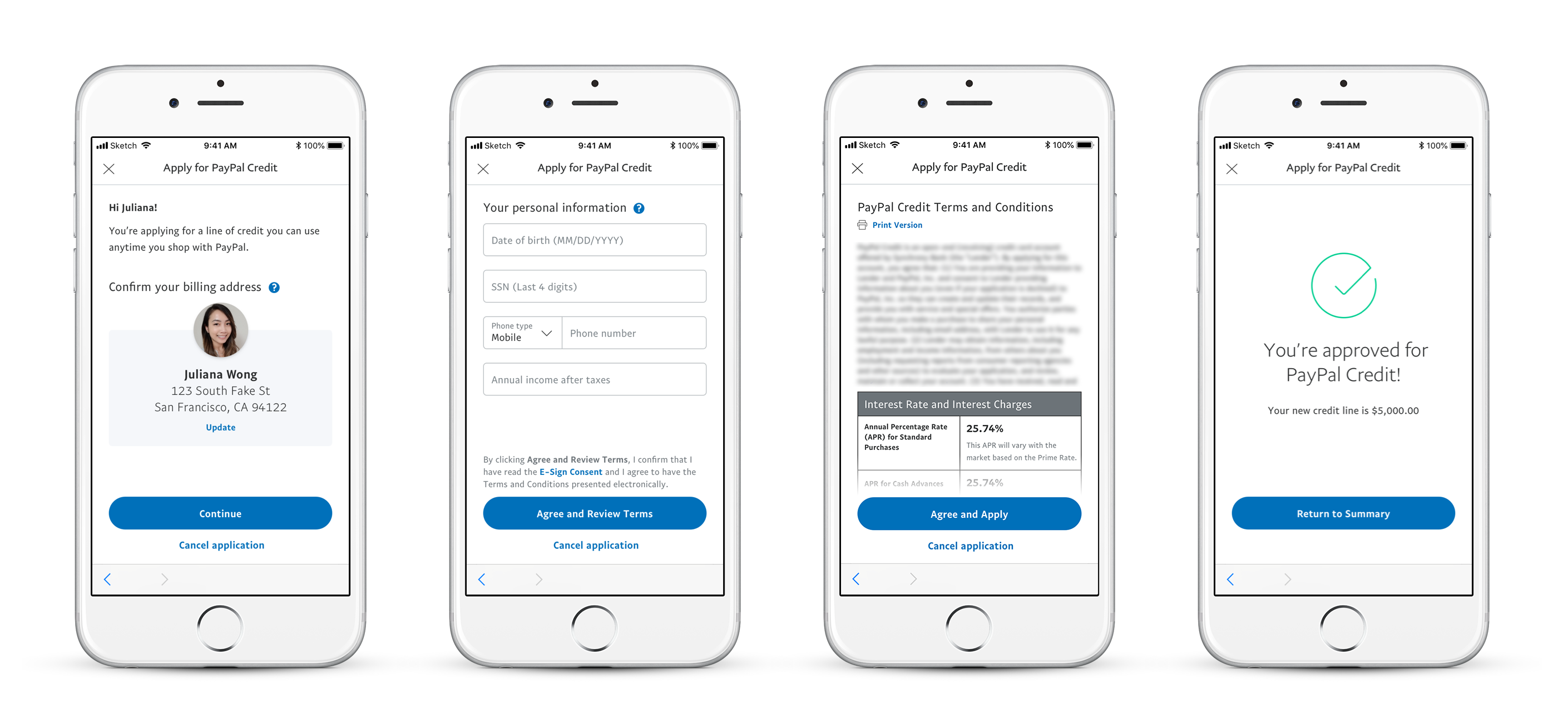
Pre-fill data we already know about the customer in an easy to scan way
Collect the more sensitive data on the 2nd page of the flow
Sticky floating CTA at the bottom of screen on content heavy terms page
Success was measured by the amount of net new actives we acquired through this channel while closely monitoring the 7-day account closure rate to confirm users are signing up for this product purposely. There wasn’t any impact to the account closure rate, which means all users intended to sign up for PayPal Credit.
200
increase in application start
62
increase in monthly accounts