This project truly shows the impact of empathetic design thinking while working within the constraints of the highly regulated collections space.
Initially, I was brought on this project to help conduct user research and explore design variations. When the lead designer left the company, I took over as lead and quickly pivoted due to feedback from legal and additional requirements. I created the go-to market MVP solution for the U.S. and worked closely with product, legal/compliance, content, and engineering to bring this experience to fruition.
My role: Lead designer
Platforms: Responsive web
Disciplines: UX/UI, Prototyping, User Research/Testing
Tools: Sketch, InvisionApp
Launch: October 2017
Some PayPal Credit users fall behind in payments due to unforeseen circumstances. Payment plans are available, but they are only offered through speaking with a customer service agent/rep.
- Stay true to the PayPal brand attribute of “on your side” by being as transparent as possible
- Make it simple and easy for a customer to self-enroll in a payment plan, make payments online, and track payment plan progress
- Reduce calls to customer service related to collections
- Mitigate loss and reduce net credit losses (NCL) by millions annually
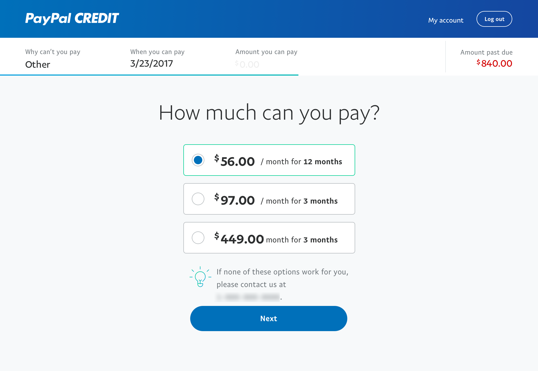
Recommend a plan
The first idea I tried was to create a flowchart of questions where depending on the answers, the user would get recommended the right plan for them. My rationale is the user is already stressed, so I wanted to guide them through and sprinkle as much encouragement throughout the experience.
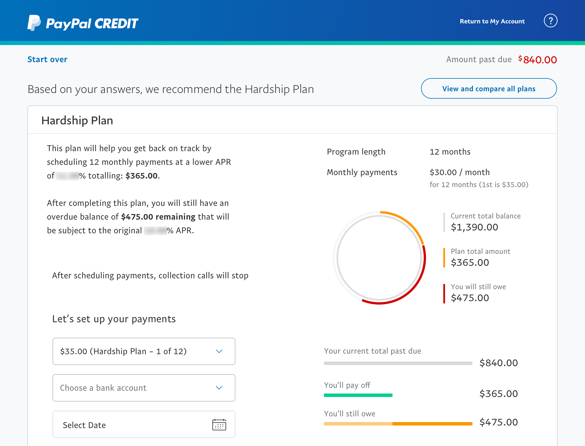
Visualize plan details
I explored many ways to explain how the plan works, from different layouts to visual graphs. I wanted to over explain as much as possible so that the user knows exactly what this plan means to them.
Comparison table
This idea is to pull out the key similarities and differences between each plan and display them in a scannable way. However, the plans are a bit like comparing apples and oranges.
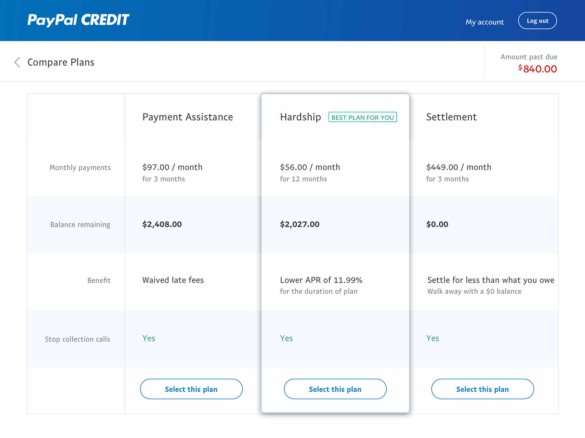
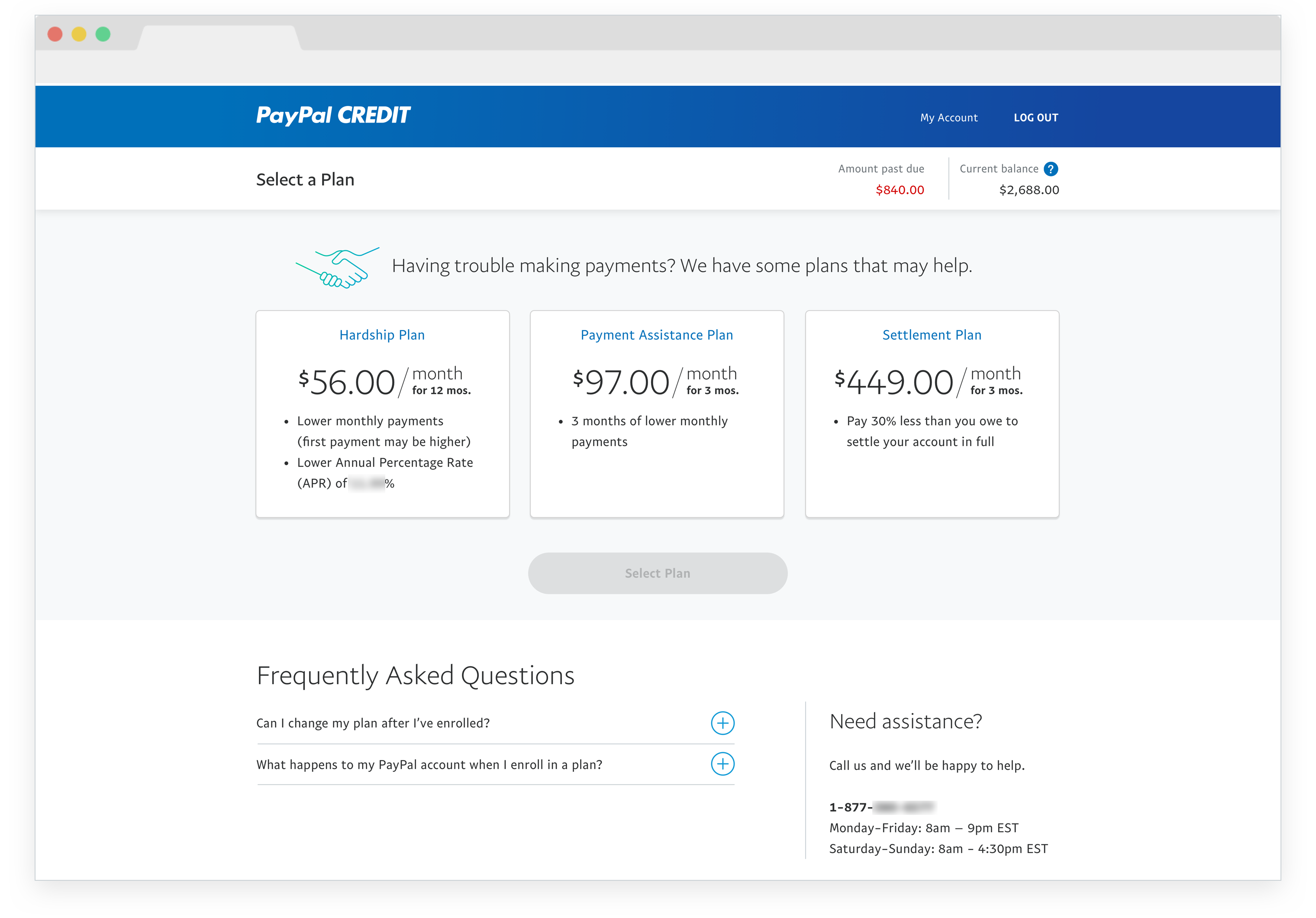
Easy to scan and compare plan highlights
FAQs of questions we heard often from the call center
Phone number/help line available at anytime
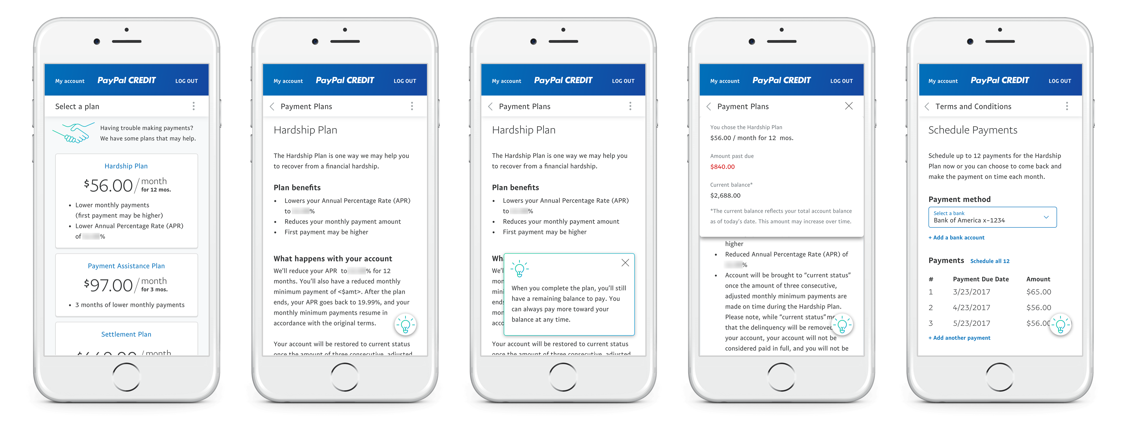
Mobile web screens showing how the persistent top bar and tips box collapse and expand
Ability to go back to review all plans again
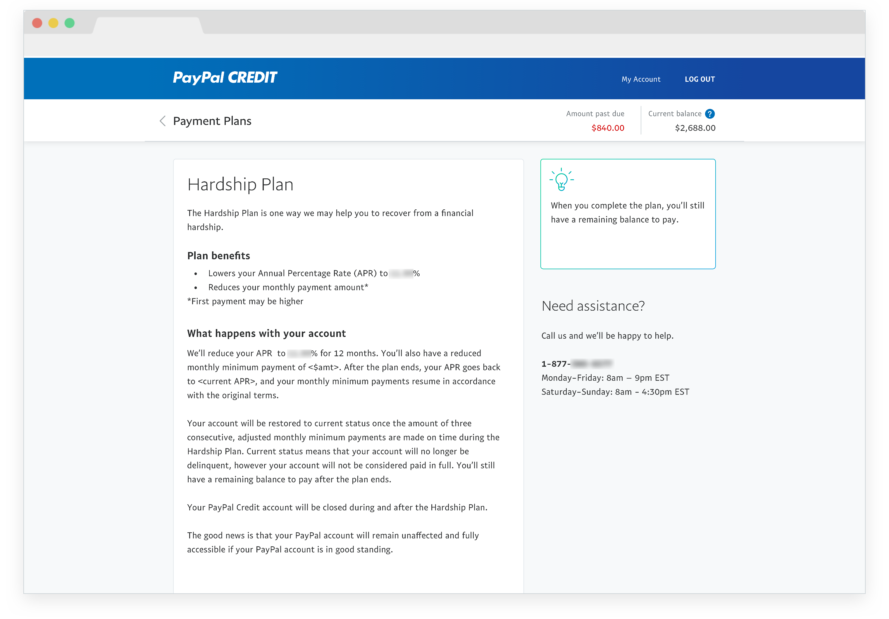
The terms summarized in a more human and digestible way
Customer service information available at anytime
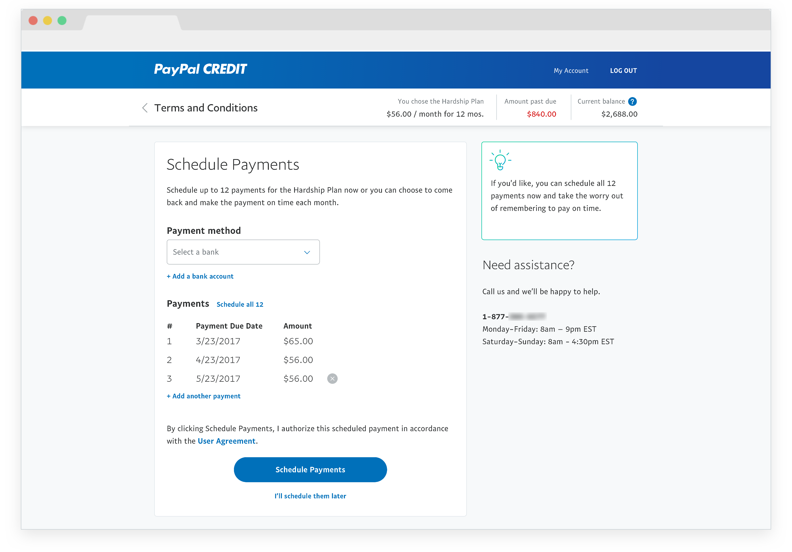
Persistent toolbar to keep user in context of plan details and remaining balance
Helpful tips area to encourage user and provide suggestions
Ability to schedule all future payments for the plan
Success was measured by the amount of users who successfully enrolled in a plan, and even more so on the amount of users who schedule a payment. This is because someone could enroll but never make any payments, so they wouldn’t be moving the needle on getting back to good status.
I’m really proud of this project because of the legal challenges I transformed into friendly UX. Even though my initial idea wasn’t built, I was able to bring a lot of my original features/elements such as encouraging tips to the final design.
50
of eligible users discovered the entry point and started the flow
70
reduction in call center volume related to collections
70
of enrolled users set up automatic payments
5
dollars in net credit losses recovered in one year